Artist Schedule Management
Background
In the live entertainment industry, managing an artist’s schedule is chaotic by nature. Talent managers often juggle multiple calendars, venues, travel logistics, rehearsals, interviews, and administrative tasks - all for several artists at once. Most teams rely on a patchwork of spreadsheets, Google Calendar, WhatsApp messages, and manual notes to stay on top of everything.
This project aimed to centralize and simplify that process by creating a purpose-built scheduling and task management platform tailored to artist managers. The platform needed to accommodate both high-level calendar overviews and detailed task management for different roles - from booking agents to artist assistants.
Research
In this project, the initial problem was provided. Rather than simply accepting the requirements as given, I proactively deepened my understanding by conducting secondary research - reading relevant articles, participating in industry groups, and analyzing user reviews of comparable management software.
The goal was to gain a broader perspective on industry context, uncover real user pain points, and understand the UX standards set by similar products.
Based on these insights, I defined the problem statement along with a set of "How Might We" questions that guided our design solutions.
Problem Statement
Artist management teams, who must coordinate multiple artists, staff, and dynamic schedules, need a streamlined way to manage complex calendars and tasks because frequent changes, overlapping commitments, and scattered information currently lead to missed deadlines, double bookings, and daily overwhelm.
How Might We
Design
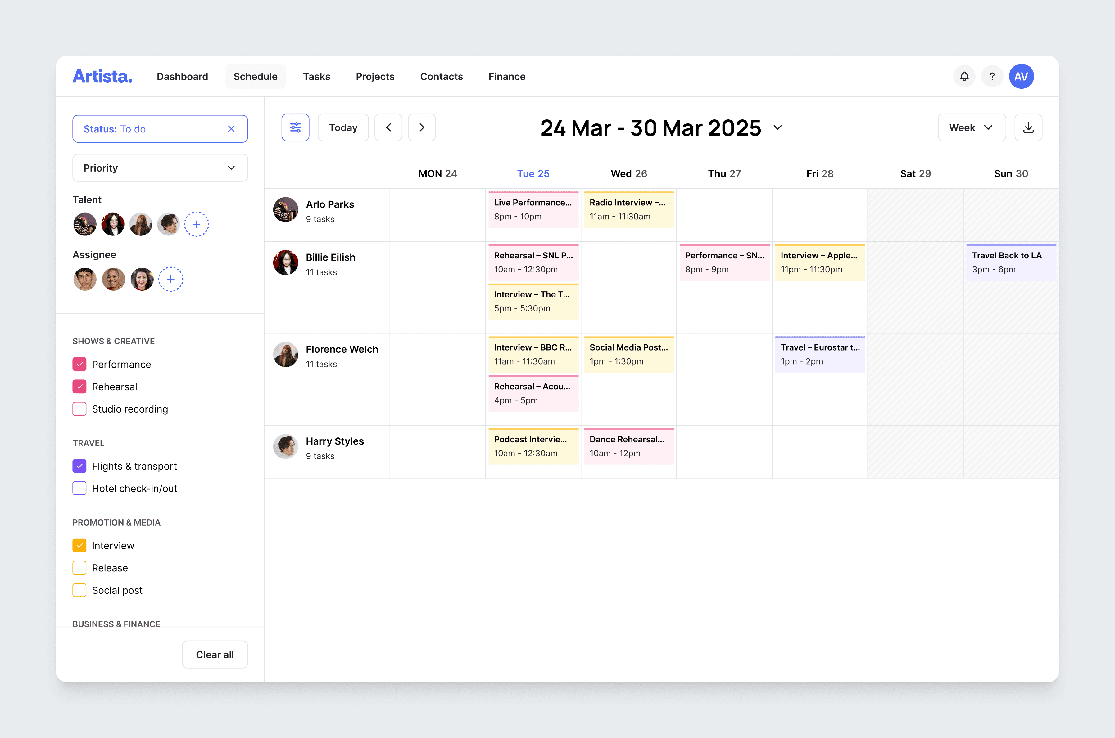
View overview
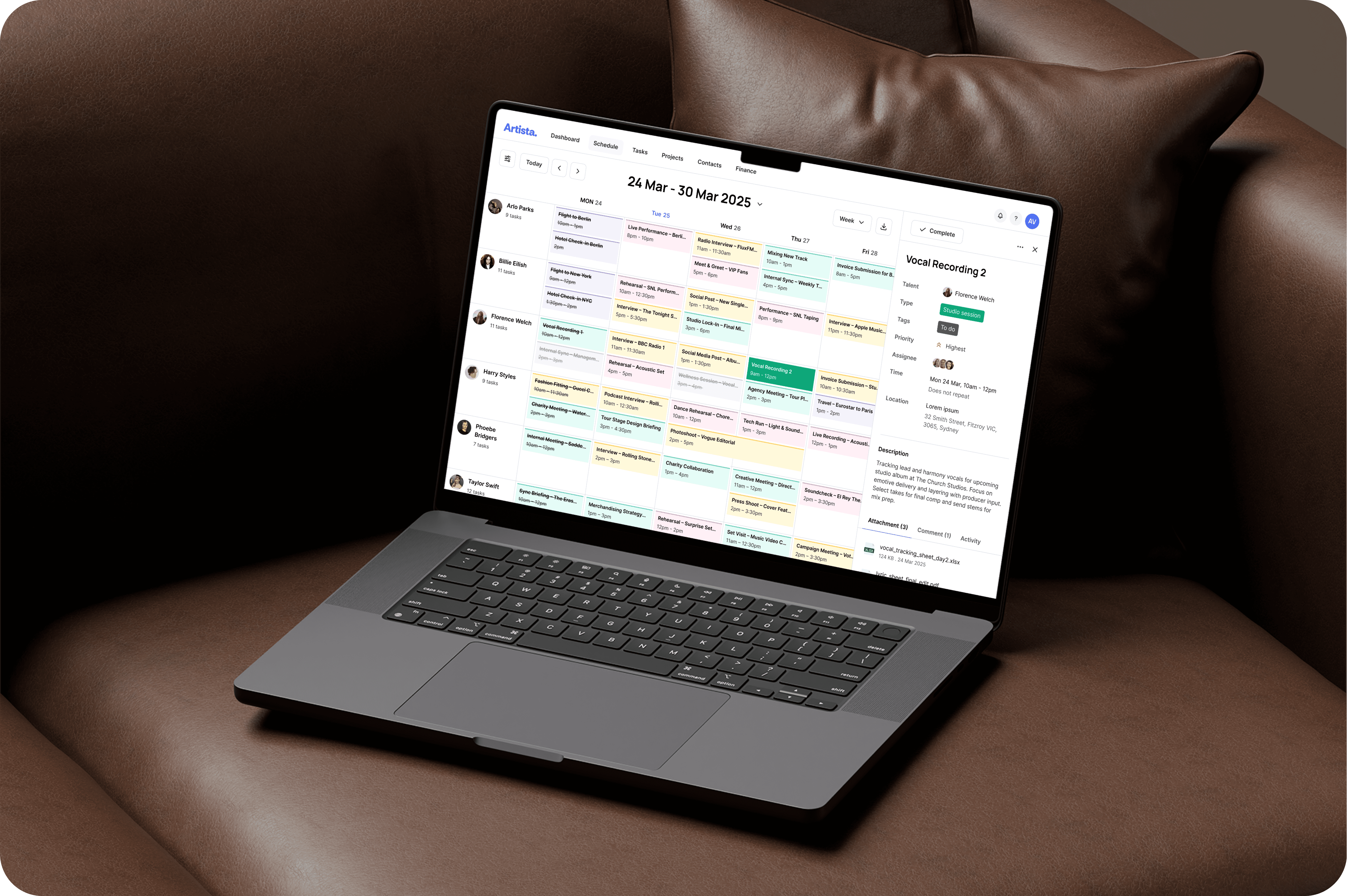
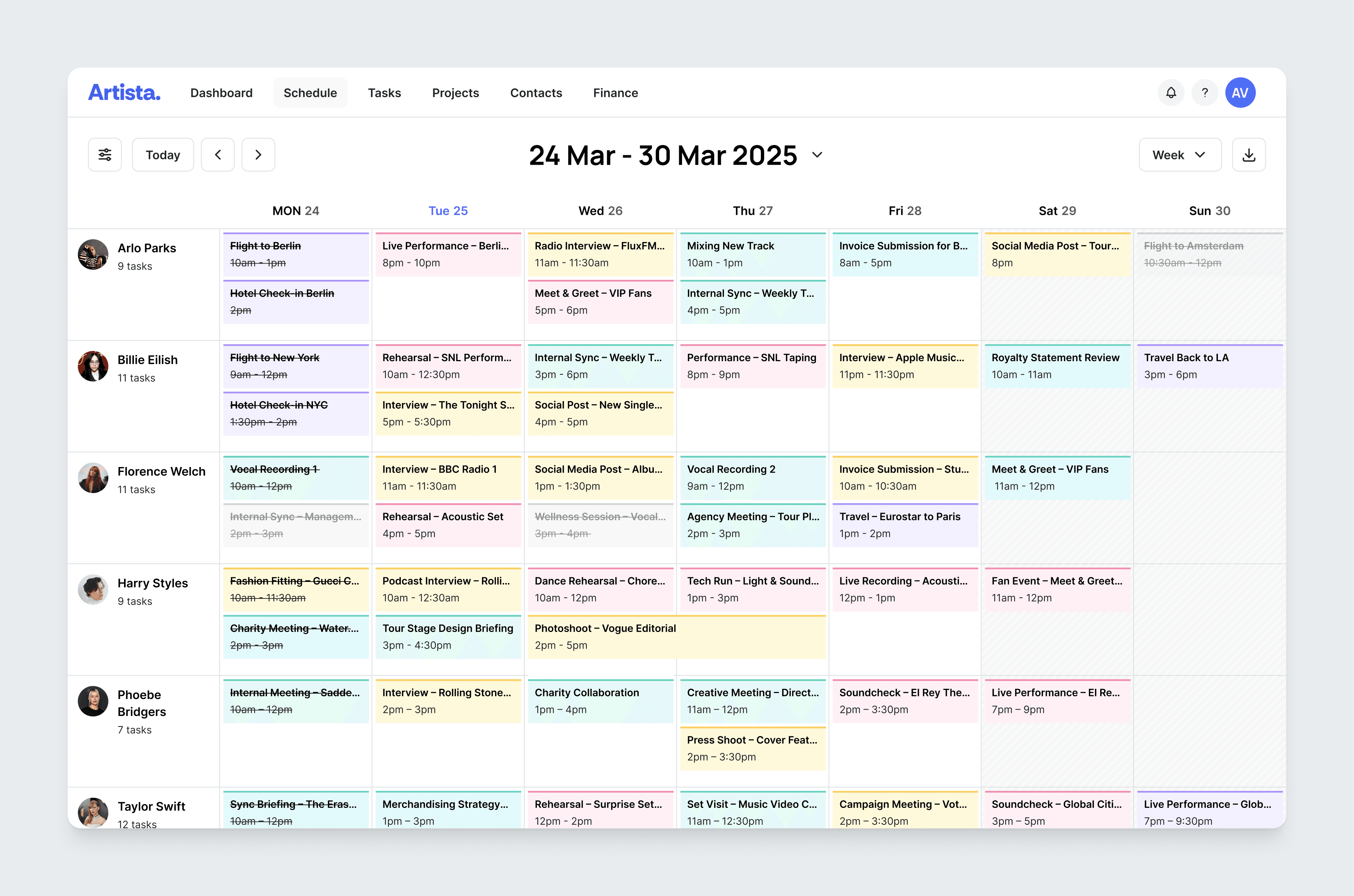
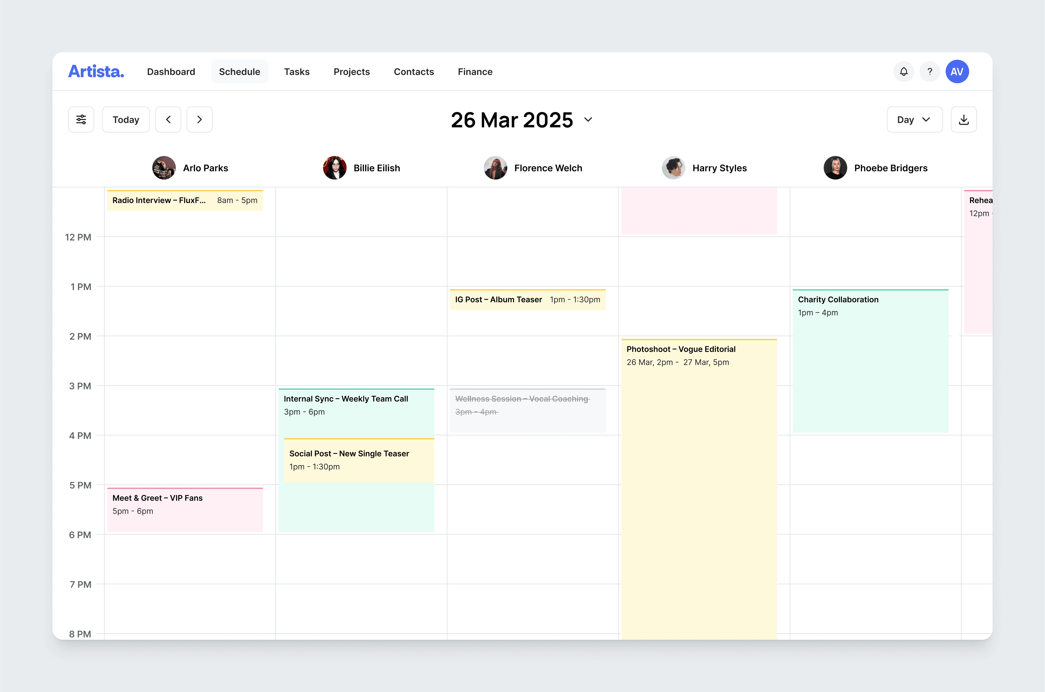
I fixed the talent column vertically in week view and horizontally in day view, instead of using a standard calendar layout like Google calendar. Managers and staff often work with multiple artists at once. Keeping talent visible at all times makes it easier to track and compare each artist’s schedule, even as the calendar fills up.
In week view, each talent stays fixed on the left, so users can easily scan tasks by artist across the week.
In day view, talents are fixed at the top, making it simple to review and manage all artists’ activities for a single day.
View details
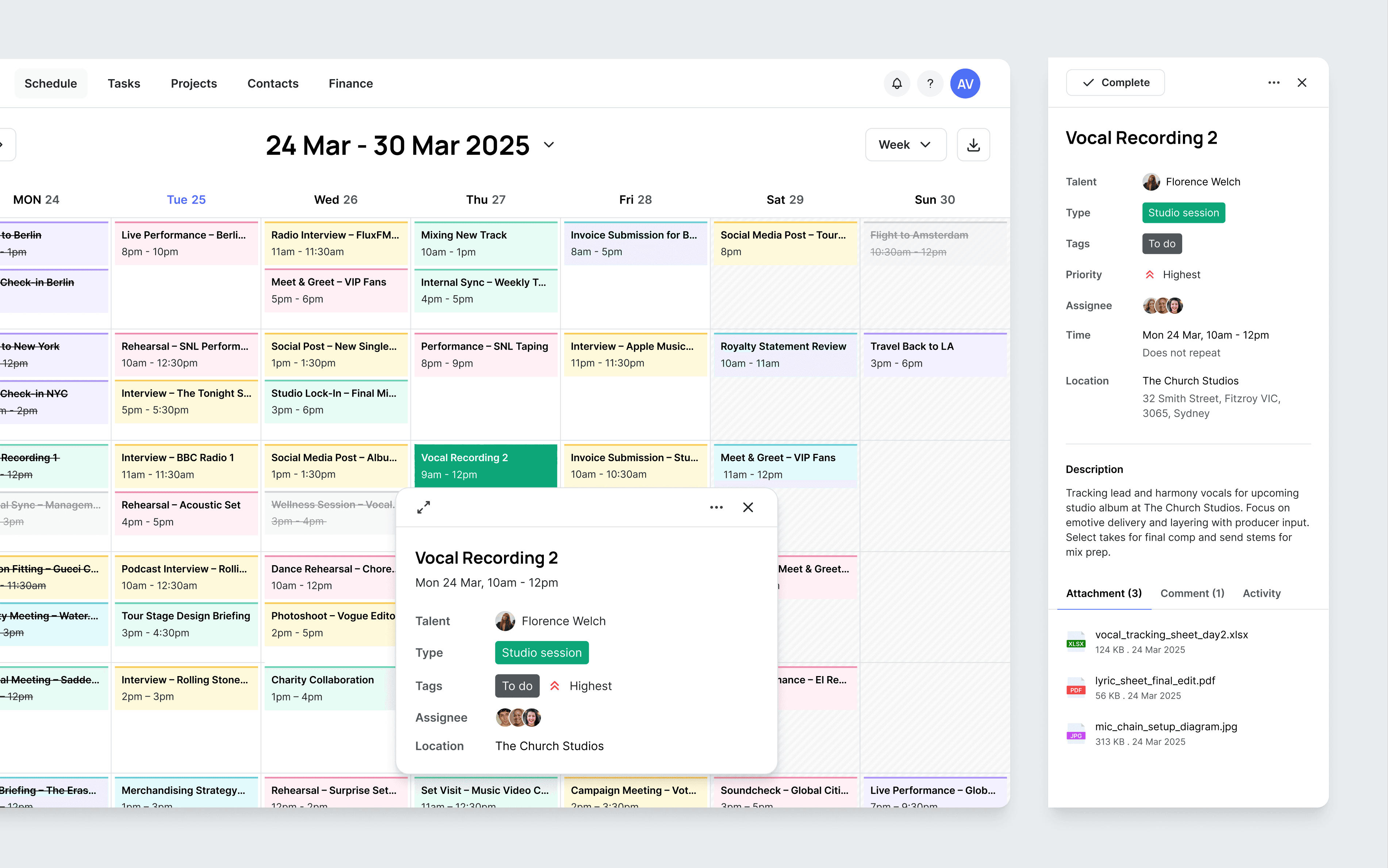
I implemented a split-detail system: a quick-view popover for rapid scanning, and a right panel for full task details. This approach helps users manage multiple tasks quickly without losing context or getting overwhelmed by too much information at once.
I considered alternative approaches, such as using a popup or navigating to a separate page for full task details. However, these options risk interrupting the workflow and breaking the connection to the overall schedule. Displaying details in a persistent side panel allows users to review or compare information - like time, workload, and task context - while always keeping the broader timeline in view.
Edit
I chose to use a dedicated edit view instead of inline editing, because each task in artist management contains many important and complex details.
This approach minimizes accidental edits, encourages users to enter data more carefully, and always provides a chance to review changes before saving. It makes managing multiple artists and critical schedules safer, more proactive, and easier to control for the whole team.

In designing the edit view, I organized information into logical groups:
What’s happening: task title, type, status
Who’s involved: talent, assignee
When and where: date, time, location
What to prepare or follow up: description, attachments, comments
However, since task title and talent are the two most important identifiers, I placed them at the very top of the form. This ensures users always see and confirm the core details first, supporting faster and more accurate editing.
Add
I designed a “quick add” popover, allowing users to simply click on the cell for a specific artist and date to create a new task without cluttering the interface. Managers often handle many tasks at once, so searching long lists or re-entering repetitive information can waste time and lead to errors.
With this approach, the talent and date fields are auto-filled by default, minimizing manual steps. Users can expand the form to add more details if needed. When assigning staff, the dropdown prioritizes frequent collaborators, making task delegation both faster and more accurate.
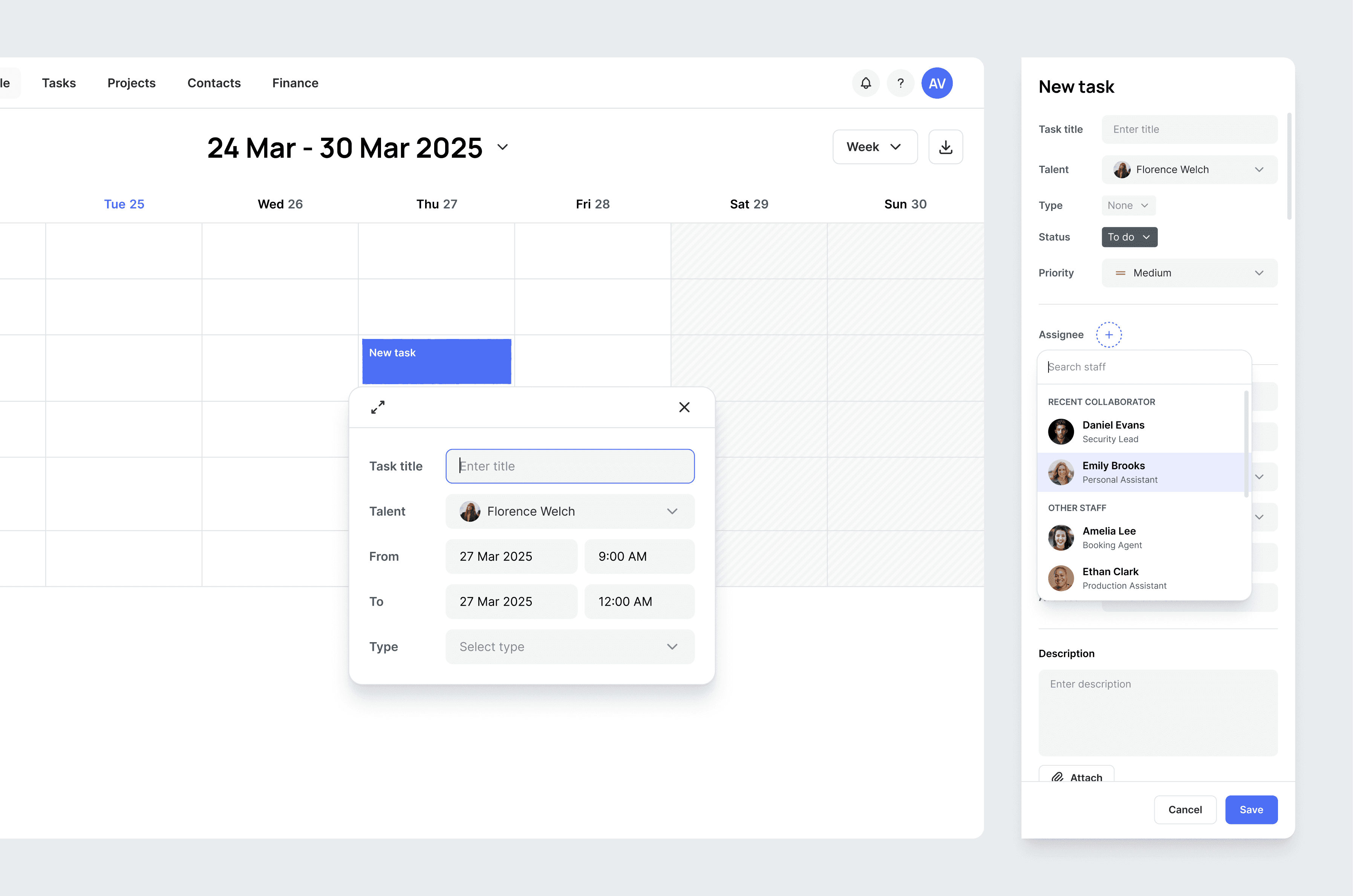
When a task overlaps with an existing one, the system still allows users to create it, while also displaying an inline warning beneath the input field to keep them aware of the conflict.
Implementing an inline warning (instead of a pop-up or a hard block) offers a smoother and more empowering user experience:
Double booking isn’t always a mistake. In certain cases, users may intentionally schedule overlapping tasks—such as parallel meetings or personal reminders. A soft warning is sufficient in these situations; there’s no need to enforce restrictions.
Pop-ups triggered after hitting “Save” can cause confusion or delays. Especially when users are in a rush or entering multiple tasks in succession, such interruptions can lead to frustration or missing details.
Inline warnings help maintain workflow continuity. Users aren’t interrupted mid-input, yet they remain informed of potential issues and can choose how to proceed - striking the right balance between transparency and user autonomy.

Filter
I grouped task types and assigned each group a unique color, displaying filters vertically in the sidebar. With many different task types, a vertical filter layout is more intuitive and makes it easier for agencies to customize or add task types based on their unique workflows.
This structure allows users to quickly scan, filter, and focus on relevant tasks, while giving agencies flexibility to expand or adjust categories as their needs evolve.
Conclusion
Designing a talent management system comes with intense pressure - not just because of the sheer volume of information, but because users need to make fast decisions in the middle of chaos. How do you turn that complexity into something understandable, actionable, and controllable? That was the biggest challenge in this project - and also what made it so rewarding.
To avoid overwhelming the user, I had to constantly balance functionality with simplicity - building an interface robust enough to support complex workflows, yet clean and focused enough to avoid visual fatigue. On the UI side, this meant using restrained colors, clear typography, and thoughtful layouts - not flashy, but modern, readable, and easy to scan. On the UX side, I had to step into the mindset of the managers: they don’t have time to click through endless steps or memorize flows. Everything needs to be fast, obvious, and always within reach.